Follow the brown signs


More brown sign history unearthed
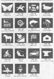
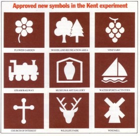 This image is taken from a supplement called “Signs of the Times 84” published by the English Tourist Board as part of their “Tourism in Action” project. It was in 1984 that the brown sign as we know it was born. These symbols were first used in Kent as an experiment and were found to be useful for directing tourists to attractions and facilities by owners and motorists alike, so after their success in Kent the Department for Transport then rolled them out across Britain. Me being from Kent and born in the ’80s I wonder whether this project subconsiously seeped into me from an early age and explains my obsession with brown sign, who knows…
The nerd in me would like to point out 2 main changes in the early symbols…
– The Museum symbol used to be a vase contained in a house, it is now an M in a house (I’d love to attach an image to demonstrate but luckily for me the graphics card in my computer melted into the motherboard last week and now my hard drive files have all corrupted, so I can’t. The less we talk about it the better to be honest, moving on…). I assume that having an image of a vase was rather too specific for the diverse subjects that museums across britain are dedicated to (from paperweights to lawn mowers) so it was changed.
– The Church symbol was a cross, which rather confusingly looks very much like an arrow loop, similar to those found in castle walls. Perhaps this is the reason why it was changed because the church symbol we have today is a much easier to recognise image of a quintessential church with a steeple. (There’s still a brown sign with the old church symbol on the M20 pointing the way to The Friars in Aylesford, if you want to see one…).
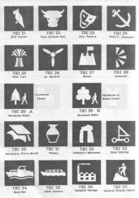
 These images are from a booklet called “Trafex 87 Tourist Attraction Signing” and was published 1987 to illustrate a more full and encompassing range of images that were approved and could be officially used on brown tourist signs. This booklet contains around 60 symbols, so the rest (around 30) have been added since. There are a few changes to the symbols over the years and some have since been removed. My favourite removed ones are “sand yachting” (1st page, far right 4th row down) and “cabin accomodation” (2nd page far right 3rd row down). I assume there weren’t too many applications for sand yachting brown signs (but oh my God if I saw one I’d definietly follow it!) or cabin accomodation, and hence their removal, but more to the pity I think.
I just love seeing how the symbols evolved and changed over time, it really really shows what Britain has to offer in terms of the diverse and interesting things there are around for us to see and do.
There are more images and details being added to my new “history of the humble brown sign” page all the time, so if you’re as geeky as me and like this stuff then be sure to check it out. If you have any stories, pictures or information that are in any way relevant to brown tourist signs then please do get in touch, I am always interested and all about sharing it.
My sincerest thanks go to Simon Morgan of Buchanan Computing (who create innovative software for traffic sign design) for taking the time to rifle through boxes of old Department of Transport records and archives to find the relevant booklets, images and information related to tourist signing, and then bother to scan and send me the pages you see above. I wouldn’t be able to do my project without the Simon Morgans of this world, so Simon, a massive thank you 🙂
